
New York
Foundation for Arts
OVERVIEW
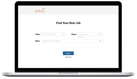
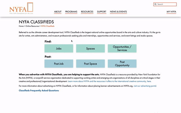
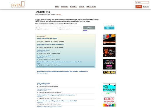
New York Foundation for the Arts (NYFA) Classifieds is one of the largest national online opportunities board in the arts and culture industry. For this project, we redesigned the Job Board Experience for both job seeker and job advertiser.
PROBLEM
Difficulty selling long job advertisement plan because of the radical traffic dropping for job listing after 24 hours regardless of its relevance.
METHODS
Competitive analysis
Service blueprinting
Guerilla testing
Usability testing
Sketching
Wire-framing
Parallel prototyping
CHANLLENGES
1. For Job-Seeker, increase the quantity of relevant job postings reaching these users
2. For Job-Advertiser, increase the perceived and actual value these users get from advertising with NYFA
RESULT
“The team not only helped us gain a deeper understanding of our problems, but provided us with great implementable design solutions.”
— Director of Sales and Communications at NYFA

My Role
UX Researcher & Designer
I conducted user research, designed the wireframes and prototypes and led the design iteration for job seeker. This was a 12-week project in collaboration with 3 other designers. We worked closely with customer service, sales and IT PM, from defining the goal, conducting user research to prototyping design solutions.
DEFINE THE SCOPE - CLIENT WORKSHOP
Based on our project vision alignment with NYFA team, we identified two approaches:

To increase job seekers engagement
To increase job advertisers check-out experience
We conducted a vision alignment exercise with representatives from sales, customer service and IT. With the exercise, we identified the project scope, target users, measurement of success and constraints of the project.
We approached this project from two phrase: the first phrase is focused on job-seeker searching experience, the second phrase is focused on job-advertiser posting&checkout experience.
PHRASE 1 : DESIGN FOR JOB-SEEKER
DISCOVERY AND RESEARCH
From the user testings, we learned that:
Even if a job posting was old, if it was relevant enough, users would still apply; Relevance and personalization would be key for compensating for traffic drop-offs.
We conducted 8 user testings with job seekers on current NYFA website.
The user testing was consisted of observation and interview. We hoped to learn about job-seekers searching behaviors and their needs.
I don’t give up the chance of applying to an old job posting but I expect that I have a smaller chance… It depends on how well-fit the job is.
— User Testing Participant
ANALYSIS AND DESIGN
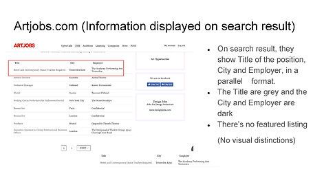
Competitive Analysis
We conduced competitive analysis to understand the weakness and strength of different job boards.
We chose six competitors with similar job boards for artists. Then we identified four dimensions analysis based on the following four dimensions :
- Pagination (how users load more information, i.e. numbers at bottom, load more button
- Information displayed on Search Page vs. on Job Detail Page
- Filter & Sorts
- Job Posted Date
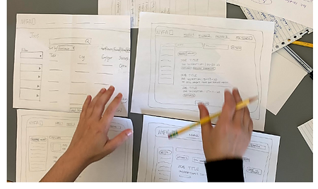
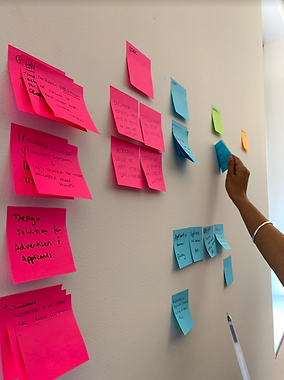
Brainstorming and Sketching
Each of us sketched on paper. After discussion, we condensed our ideas into three wireframes.
We brainstormed different ideas based on findings from competitive analysis.
Wireframes for Testing
We explored design ideas such as quick apply on search page, sort by “deadline approaching”, scrolling auto-load, skill tags etc.

TESTING AND ITERATION
Guerrilla Testing
From the guerrilla testings, we learned that:
Our design changes are not significant enough to achieve our goal of helping job-seekers reach more relevant opportunities.
We conducted guerrilla testing on an art school campus to capture the targeted users. The goal was to test with as many uses as possible within limited time.
Within two hours, we conducted testing with 8 users from our targeted user group.
These are nice tools, but I don’t know how to use them… I’ll probably still just go through the first few pages of results after keyword search.
— User Testing Participant
Shift Design Direction

On-Borading Experience of Bank of America

We returned to our key finding - Relevance - introducing on-boarding to personalize the experience.
We looked at other job boards to understand how they were providing relevant results to their users.
By introducing a customized on-boarding flow before users even saw available listings, the interface guide users through the most helpful question tools to filter for high-quality high-relevance results. Therefore, users will be able to land on a job page with relevant listings that they are much more likely to engage with.
HI-FI PROTOTYPE
Purposefully we didn’t want to make big visual changes because NYFA had just finished redesigned a new website version, we focused on small but impactful experience design nudges.
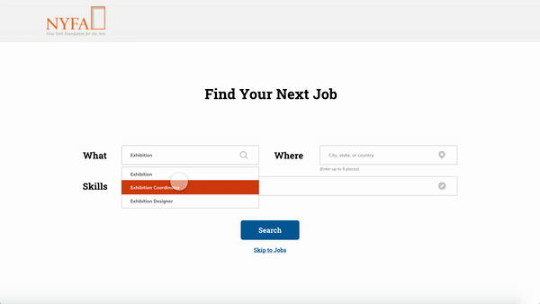
1. Add On-Boarding Experience
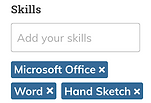
We created an on-boarding experience to make sure users land on the search page with relevant results. We added location and skill tags to match users with most relevant opportunities.
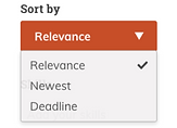
2. Search Result Page
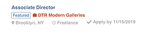
We introduced more sorting options and made the result display more action-oriented. We made the display of featured listing more consistent with average listing to reduce the advertisement effect.
Before.
After.
Expand Sort by and Filter options
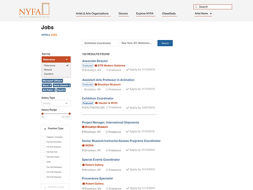
Make the featured listings look more similar to non-featured listings

Before.
After.
3. Similar Opportunities
We added similar opportunities at the bottom of the job detail page to encourage users expand their search.
We moved the post date to the end to deemphasize its importance
Similar Opportunities
FINAL PROTOTYPE
Desktop

Mobile


PHRASE 2 : DESIGN FOR JOB ADVERTISER
DISCOVERY AND RESEARCH
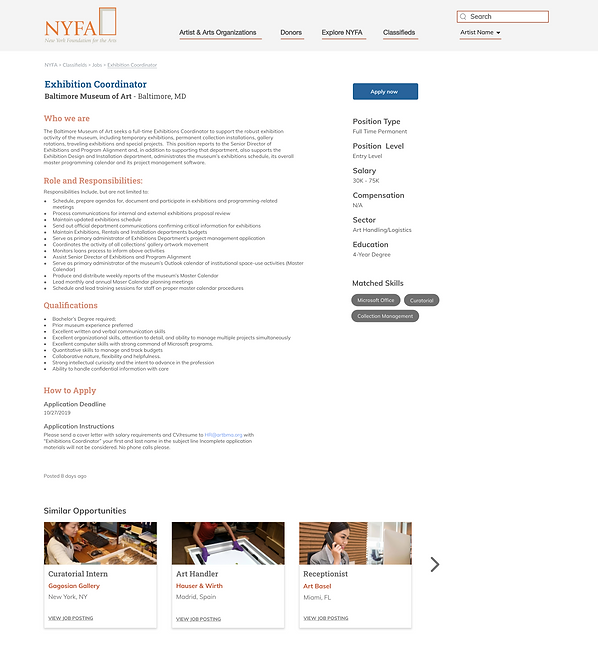
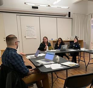
NYFA has a unique process of creating and reviewing its job listings, therefore we conducted a workshop to create this service blueprint with NYFA staff.
Advertising with NYFA requires a few touch points between NYFA service team and advertisers. It starts with creating an account (advertisers are required to create account) to the job listing being live, then expire or position filled.

From the service map exercise, we decided to focus on solving the these two major pain points:

Unique Review Process
NYFA has a unique review process before the listing goes live. This process ensures that NYFA carries quality jobs.
However, a lot of advertisers were not aware of this process. It led to a big input on explanation and follow-ups from NYFA customer team.

Payment Expectations
Historic data shows that a significant percentage of users left on the payment step of creating a job listing.
We boiled it down to two reasons:
1. There was no information about advertising cost prior to creating a job listing
2. Users’ perception of NYFA as a non-profit organization.
REDESIGN CHECKOUT
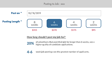
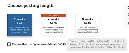
We think payment plan selection is one of the most crucial steps for NYFA to sell to advertisers.
Currently, NYFA has a very simple pull-up menu for its different plans. We hope to have a more direct impact on the goal of “increasing revenue” by redesigning the plan selection.
We explored different designs for plan selection based on two principles:
1. Make sure users are aware of all the purchase options.
2. Increase sales for 4-week plan.
Design Exploration
We explored design ideas such as plan recommendation, “popular tag” and feedback for plan selection. In addition, we added on-boarding page, review progress timeline, and tooltips throughout the posting process.


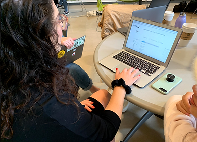
COMPARISON USER TESTING
We had user testing sessions with five job advertisers.
We asked participants to create a job posting on both NYFA current website and our new prototype.
Three of them were frequent advertisers with NYFA. Two of them have never posted on NYFA before. After user testings, we used Rainbow Sheet to analyze the results.

HI-FI PROTOTYPE
1. On-boarding Page with Overview of Important Information
Originally, advertiser dives right into create listing.
We added an on-boarding page to provide an overview of the process, mention price in an appealing way beforehand and make a pitch of featured listing (pay additional)

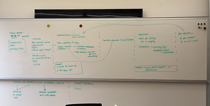
2. Surfacing all Payment Options
We changed the plan selection from a pull-up menu to cards, surfacing all options to advertisers. We also added suggestions based on different advertising needs (eg: urgency, job level) to help advertisers make informed decisions.
Before.

After.
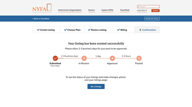
3. Where to Go Next
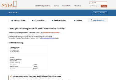
We added a progress bar and a call to action button on confirmation page to inform advertiser about what to expect after the post.
FINAL PROTOTYPE

WHAT I LEARNED
1. It is important to test early in the process.
Our first user testing proves our design direction wrong. It was frustrating but it was a valuable learning experience. We were able to changed our design directions based on user feedbacks before spending more efforts on the incorrect design solution.
2. Small design changes can be impactful.
This project has a lot of limitations regarding its visuals and tech, however, from the our multiple rounds of user testings, it proved that small insightful design changes can still make significant impacts on the outcomes and project goal.