Accessible Kiosk
OVERVIEW
This kiosk project was designed to help students & visitors in wheelchairs use existing kiosk on campus to navigate around the campus. For this project, we conducted usability testings and proposed design suggestions for efficient fixes.
Tastebud
•Mobile App
RESULT
GOAL
1. To evaluate the usability of the kiosk for wheelchair users
2. To improve the usability by providing actionable insights and design recommendations.
RESULT
1. Engineering team was able to implement our major design solutions in one month and launch the project on time.
2. 20% increase in overall user satisfaction compare to beta test.
RESEARCH PROCESS
Usability Plan
Tasks
Development
Participant
Recruitment
Metrics
Selection
User
Testing
Data
Analysis
Recommendations
Development

My Role
UX Researcher & Designer
This was a 4 week project in collaboration with another researcher. I worked from defining the goals with different teams to conducting the usability tests and proposing design solutions based on test results. I was also responsible for recruiting, scheduling, follow-up payment and other logistics.
DEFINE THE GOAL
We boiled the challenge down to three questions:
Is the kiosk easy to use?
Is the interface design accessible for users with access concerns?
Is the provided information helpful for navigation?
i had a lot of troubles when I visited my girlfriend on campus, I think a kiosk would be really helpful.
— User Testing Participant
METHODOLOGY
Scenario-based Tasks + Interview
+ Questionnaire
We start with a few interview questions to understand wheelchair user’s general needs and concerns when visiting a location. Then participants were asked to complete six scenario-based tasks on the kiosk. At the end of the session, participants would fill out an evaluation form.
TASKS
We want to learn how users interact with different destination information.
1. Plan an accessible route to a building
You are at Myrtle Hall, please plan an accessible route to ARC building.
2. Find where an office is located
You want to go to the Learning and Access Center, please find where the office is located.
3. Browse art installations on campus
You are a visitor, and you want to see the artworks on campus, please browse the artworks on campus.
4. Find where a class is located
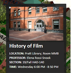
It’s your first day of college, you’re taking class History of Film, please find out where the class is located.
5. Find where a staff is located
You’re an alumni and you want to visit Provost Kirk Pillow, please find out where his office is located.
6. Find where a lab is located
You’re an artist and you want to use Pratt 3D Printing Center for your work, please find out where the lab is located.
5 Participants

3 Participants with severe access difficulties,
2 participants with moderate access difficulties.
Metrics
SUS (System Usability Score)
Task Difficulty
1
2
3
4
5
Observation Notes&
User Quotes
Task
Success Rate
Task Duration
AREAS OF ACCESSIBILITY ISSUES IDENTIFIED
We summarized the issues into three categories:
Navigation Hierarchy:
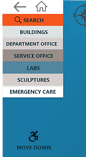
The navigation menu is small and lacking hierarchy; it adds difficulty for use on a big screen.
Information Feedback:
The feedback doesn’t match user’s search; The information is missing labels or categories.
Map Interaction:
Users have difficulty making spatial relations; They are constantly locating where they are on the map.
RECOMMENDATIONS
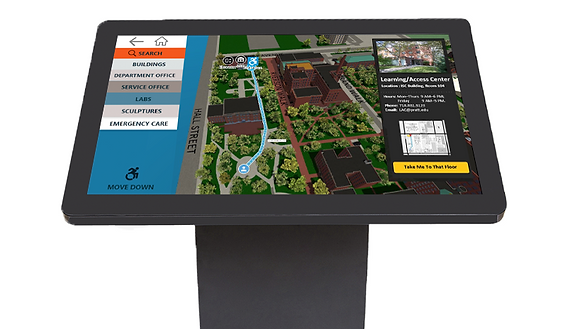
1. Add “Move Down” action button
Users in wheelchairs had difficulty reaching the top of the menu due to the height and size of kiosk, therefore, we added a "move down" button for users to lower the menu.
2. Replace auto-zoom with an action button
Originally when user looks for an office, the map auto zooms onto the building then the floor the office is located at. We found the auto-zoom made it difficult for users to process the information. Therefore, we replaced the auto-zoom with an action button "take me to that floor".
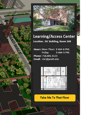
3. Label important information
Before, when user searched for location of courses, the information box didn't reflect user's search. We rearranged the information to highlight user's search, and we added labels to important information.
Now


Now

Before
Before
4. Visualize the Direction
We learned that users memorizes directions best when the route is visualized on the map with building names. Before, the visualization was only available to when users searched for buildings. Now, the route visualization is always available regardless if the users search for office, classrooms or labs.

East Building
Library
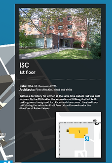
ISC Building

5. Add "Locate Me" Float Button
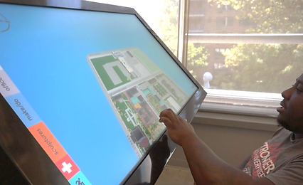
The kiosk is defaulted to plan the route from where it is located. However, users, especially visitors, were often confused about where they are located at. We learned that a clear definition of the start point and destination is crucial to user's way-finding process. Therefore, we added a "Locate Me" button. When user clicks on the "Locate Me", the screen will zoom out to provide an overview of the route-then zoom in onto the start point.
WHAT I LEARNED
1. Make Plan Schedules Ahead of Time
We had a tight time budget for this project. In order to make full use of our time, we made usability plan with schedules for each week before we started. We made sure that other teams were aware of our progress and we did our best to follow through our plan schedule.
2. Clear and Efficient Communication within Engineers
Before we started the project, we communicated with engineers to be learn their design attempts in the past and the restrictions of technology. During the process, we gained their insights on designing the usability tests. In the end, we made sure to deliver our recommendations in the best format for them.
3. Recruiting and Screening Participants!
Recruiting and screening participants was tricky for us because the study require a specific group of participants. After thoughts, we put the question "do you need equipments to move around?" in our survey to screen participants with/without access concerns. We tried to reach a wider audience through social media, online groups, and local communities.